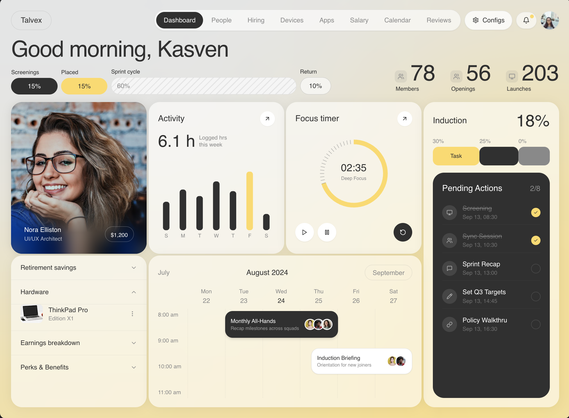
Modern HR Dashboard
Build an HR dashboard called "Talvex" using React, TypeScript, Vite, Tailwind CSS, Recharts, and Lucide React icons. The page must be fully responsive across mobile, tablet, and desktop. Here is every specification:
Font
Use "Sofia Pro Regular" loaded from this external stylesheet in index.html:
https://db.onlinewebfonts.com/c/060e116a70e3096c52db16f61aaab194?family=Sofia+Pro+Regular
Set font-family: "Sofia Pro Medium", sans-serif on all elements via CSS * selector with -webkit-font-smoothing: antialiased. The root <div> inline style uses "Sofia Pro Regular", sans-serif.
Color Palette
- Yellow accent:
#FFD85F - Dark gray (text, dark fills):
#303030 - Light gray (secondary text, borders):
#898989 - Card backgrounds:
white/60withbackdrop-blur-3xl - Card shadows:
0 2px 20px rgba(0,0,0,0.06) - Profile photo card shadow:
0 2px 20px rgba(0,0,0,0.10)
Background
A full-screen fixed SVG background covering the viewport with preserveAspectRatio="xMidYMid slice". Viewbox is 0 0 1280 832.
- Base: a rect filling
1280x832with#E3E5E6 - On top: a large yellow
#FFD85Fblob path with a heavy Gaussian blur (stdDeviation="250"), creating a warm diffused glow in the lower portion:
M904 404C942.8 189.6 1234.83 123.333 1376 117V1093.5H-227V792.5C-161.5 706.167 0.5 556.6 124.5 649C248.5 741.4 473.833 727.5 571 709C665.833 696.667 865.2 618.4 904 404Z
The filter uses feFlood -> feBlend -> feGaussianBlur with filter region x="-727" y="-383" width="2603" height="1976.5".
Layout Structure
Two layout containers layered on top of the SVG (both relative z-10, max-w-[1400px] mx-auto):
- Desktop (lg+):
hidden lg:flex,h-screen,px-6 py-6,flex-col overflow-hidden. The dashboard grid area isflex-1 min-h-0. - Mobile/Tablet (<lg):
lg:hidden,min-h-screen,px-4 sm:px-6 py-6,flex flex-col gap-0 overflow-y-auto, with ah-6spacer at the bottom.
Both contain: Navbar, WelcomeRow, DashboardGrid (in that order).
Navbar
Full-width nav with mb-4.
Left: "Talvex" text in a pill — border border-[#898989]/30 rounded-full px-5 py-2 text-[#303030] text-base select-none.
Right (flex items-center gap-2):
-
Nav links (desktop only, hidden lg:flex): Pill container
bg-white/60 border border-[#898989]/20 rounded-full px-1 py-1 shadow-sm, containing buttons for:Dashboard, People, Hiring, Devices, Apps, Salary, Calendar, Reviews. Each button:px-4 py-2 rounded-full text-sm transition-all duration-200. Active state:bg-[#303030] text-white. Inactive:text-[#898989] hover:text-[#303030]. Default active = "Dashboard". -
Configs button (hidden sm:flex):
bg-white/60 border border-[#898989]/20 rounded-full px-4 py-2.5 text-sm text-[#303030] shadow-sm hover:bg-white/80 transition-colors. Contains Settings icon (14px) + "Configs" text. -
Bell button: Same pill style (
bg-white/60 border border-[#898989]/20 rounded-full px-3.5 py-2.5 shadow-sm hover:bg-white/80). Bell icon 15px. Yellow notification dot:absolute top-1.5 right-1.5 w-2 h-2 bg-[#FFD85F] rounded-full. -
Profile avatar:
w-10 h-10circular pill button with image:
https://images.pexels.com/photos/1239291/pexels-photo-1239291.jpeg?auto=compress&cs=tinysrgb&w=80
- Hamburger (lg:hidden only):
w-10 h-10, toggles between Menu and X icons (16px). Opens a dropdown:mt-2 bg-white/80 backdrop-blur-xl border border-[#898989]/20 rounded-2xl p-2 shadow-md flex flex-wrap gap-1with same nav buttons.
Welcome Row
w-full mb-4. Flex row on sm+ (flex-col sm:flex-row sm:items-end sm:justify-between gap-4 sm:gap-8).
Left side (flex-[3]):
- Greeting:
text-3xl sm:text-4xl lg:text-5xl tracking-tight text-[#303030] leading-tight— "Good morning, Kasven" - Segment bar below: 4 flex segments with proportional widths (flex: 15, 15, 60, 10):
- "Screenings" 15% — dark gray pill
bg-[#303030] text-white rounded-full px-3 py-2 - "Placed" 15% — yellow pill
bg-[#FFD85F] text-[#303030] rounded-full - "Sprint cycle" 60% — hatched pattern pill using
repeating-linear-gradient(-45deg, #e5e5e5 0px, #e5e5e5 2px, #f5f5f5 2px, #f5f5f5 10px)withborder: 1px solid #ddd - "Return" 10% — outlined pill
border border-[#898989]/40 bg-white/60 - Each segment has a label above (
text-xs text-[#303030] mb-1)
- "Screenings" 15% — dark gray pill
Right side (flex-[2]): 3 stat blocks, each with:
- An icon badge:
bg-[#898989]/15 rounded-lg p-1.5 mb-1with Users or Monitor icon (14px,text-[#898989]) - Large number:
text-3xl sm:text-4xl lg:text-5xl text-[#303030] leading-none - Label:
text-xs text-[#303030] - Stats: 78 Members (Users icon), 56 Openings (Users icon), 203 Launches (Monitor icon)
Dashboard Grid
Three breakpoint layouts:
Mobile (<md): Single column flex flex-col gap-3. Cards in order: ProfilePhotoCard, ProgressCard, TimeTrackerCard, OnboardingColumn, AccordionCard, CalendarCard. No wrapper divs — cards render directly.
Tablet (md to lg): 2-column CSS grid gap-3, gridTemplateColumns: '1fr 1fr', alignItems: 'stretch'. Cards: ProfilePhotoCard, ProgressCard, TimeTrackerCard, AccordionCard (2x2), then CalendarCard and OnboardingColumn each col-span-2.
Desktop (lg+): 4-column CSS grid gap-1 h-full, gridTemplateColumns: 'repeat(4, 1fr)', gridTemplateRows: '1fr 1fr'. Each cell has h-full min-h-0:
- Col 1, Row 1: ProfilePhotoCard
- Col 2, Row 1: ProgressCard
- Col 3, Row 1: TimeTrackerCard
- Col 4, Row 1-2 (spans both): OnboardingColumn
- Col 1, Row 2: AccordionCard
- Col 2-3, Row 2: CalendarCard
Card 1: Profile Photo Card
Rounded-3xl with overflow hidden. Uses aspect-[4/3] lg:aspect-auto (natural aspect on mobile, fills parent on desktop). lg:h-full. Shadow 0 2px 20px rgba(0,0,0,0.10).
Image:
https://images.pexels.com/photos/1130626/pexels-photo-1130626.jpeg?auto=compress&cs=tinysrgb&w=600
w-full h-full object-cover object-top.
Blur overlay at bottom (35% height): An absolutely positioned div with:
backdropFilter: 'blur(18px) saturate(140%)'maskImage: 'linear-gradient(to top, black 40%, transparent 100%)'background: 'linear-gradient(to top, rgba(0,0,0,0.28) 0%, transparent 100%)'
Info bar: Absolute bottom-3 left-3 right-3, flex between, px-4 py-3 rounded-2xl:
- Left: "Nora Elliston" (
text-white text-sm font-medium) + "UI/UX Architect" (text-white/70 text-xs) - Right: "$1,200" in a pill
border: 1px solid rgba(255,255,255,0.35),text-white text-xs font-medium
Card 2: Activity (Progress) Card
bg-white/60 backdrop-blur-3xl rounded-3xl p-5, flex flex-col gap-3 lg:h-full.
Header: "Activity" (text-lg text-[#303030]) + arrow-up-right button (white circle w-8 h-8).
Stat: "6.1 h" (text-4xl text-[#303030]) + "Logged hrs / this week" (text-xs text-[#898989] with <br />).
Bar chart area: h-48 lg:flex-1 lg:h-auto min-h-0 wrapping a Recharts ResponsiveContainer.
Bar chart data:
S:3.5, M:5.0, T:4.2, W:6.0, T:4.8, F:7.2, S:2.0
barCategoryGap="30%", marginstop:20 right:0 left:0 bottom:0- XAxis:
fill: #898989, fontSize: 11, fontFamily: 'Sofia Pro Regular', no axis/tick lines - Bar radius
[6,6,6,6]. All bars#303030except Friday (index 5) which is#FFD85F - Custom tooltip: only shows on the Friday bar (value 7.2), displays "5h 23m" in a yellow pill
bg-[#FFD85F] text-[#303030] text-xs rounded-full px-3 py-1 shadow-md. Cursor disabled, positiony: -30.
Card 3: Focus Timer Card
Same card wrapper as Activity card. Title: "Focus timer".
Ring (SVG 180x180):
- Center: cx=90, cy=90, radius=68
- Yellow arc stroke (
#FFD85F, strokeWidth 10) covering 70% of circumference, starting from top (rotated -90deg) - 60 tick marks around the ring (tickInner = r-4, tickOuter = r+4). Ticks in the progress zone are hidden; remaining ticks are
#898989at 90% opacity, strokeWidth 1.2, round linecap. - Center text: "02:35" (fontSize 22, fill #303030) and "Deep Focus" below (fontSize 10, fill #898989)
Controls: Below ring, full width flex between:
- Left: Play + Pause buttons (white circles
w-10 h-10, icons 14px) - Right: Reset button (dark circle
bg-[#303030], RotateCcw icon in white)
Card 4: Onboarding / Induction Column
Same card wrapper. flex flex-col gap-4 lg:h-full.
Header: "Induction" (text-lg) + "18%" (text-4xl).
Stacked bar (3 segments, flex row):
- 30% yellow
bg-[#FFD85F] rounded-xl h-10with "Task" label inside - 25% dark
bg-[#303030] rounded-xl h-10 - 20% gray
bg-[#898989] rounded-xl h-10 - Each has a percentage label above (
text-xs text-[#898989])
Task list (dark panel): bg-[#303030] rounded-3xl p-5 flex flex-col gap-2 flex-1.
- Header: "Pending Actions" (
text-lg text-white) + "2/8" (text-base text-[#898989]) - 5 task rows, each:
flex items-center gap-3 py-2 border-b border-white/5 last:border-0- Icon circle:
w-8 h-8 rounded-full bg-white/10, icon 13pxtext-white/60 - Title + time. Done tasks:
line-through text-white/30. Undone:text-white - Time:
text-xs text-white/30 - Checkbox: done = yellow circle
w-5 h-5 bg-[#FFD85F]with Check icon 10px; undone =border border-white/20circle
- Icon circle:
Tasks data:
- Screening, Sep 13 08:30, done, Monitor icon
- Sync Session, Sep 13 10:30, done, Users icon
- Sprint Recap, Sep 13 13:00, not done, MessageSquare icon
- Set Q3 Targets, Sep 13 14:45, not done, Pencil icon
- Policy Walkthru, Sep 13 16:30, not done, Link icon
Card 5: Accordion Card
bg-white/60 backdrop-blur-3xl rounded-3xl overflow-hidden lg:h-full. No padding on the outer container.
4 accordion items separated by border-t border-[#898989]/15:
- "Retirement savings"
- "Hardware" (expandable, open by default)
- "Earnings breakdown"
- "Perks & Benefits"
Each item button: px-5 py-4 hover:bg-[#898989]/8 transition-colors, with ChevronDown/Up (15px, text-[#898989]).
Expanded "Hardware" content: px-5 pb-4 flex items-center gap-3 border-t border-[#898989]/15:
- Thumbnail:
w-12 h-10 rounded-lgwith image:
https://images.pexels.com/photos/18105/pexels-photo.jpg?auto=compress&cs=tinysrgb&w=120
- Text: "ThinkPad Pro" (
text-sm text-[#303030]) + "Edition X1" (text-xs text-[#898989]) - MoreVertical icon button
Card 6: Calendar Card
Same card wrapper. lg:h-full flex flex-col.
Month header: Flex between — "July" (text-sm text-[#898989]), "August 2024" (text-base text-[#303030]), "September" in outlined pill (border border-[#898989]/25 rounded-full px-4 py-1).
Day headers (ml-14 sm:ml-16 mb-2): 6 days — Mon 22, Tue 23, Wed 24, Thu 25, Fri 26, Sat 27. Day 24 is highlighted (text-[#303030]), others text-[#898989].
Time grid area: h-40 lg:flex-1.
- Left column (
w-14 sm:w-16): times 8:00am, 9:00am, 10:00am, 11:00am - Right: relative container with dashed vertical column lines (
border-l border-dashed border-[#898989]/20) - Event 1: Dark card
bg-[#303030] rounded-2xl, absolute positionedleft: 16.66%, right: 33%, top: 4px, height: 58px. "Monthly All-Hands" + "Recap milestones across squads" (hidden on small screens). 3 avatar group. - Event 2: White card
bg-white border border-[#898989]/25 rounded-2xl,left: 55%, right: 0%, top: 84px, height: 56px. "Induction Briefing" + "Orientation for new joiners". 2 avatar group.
Avatar group images:
https://images.pexels.com/photos/415829/pexels-photo-415829.jpeg?auto=compress&cs=tinysrgb&w=60
https://images.pexels.com/photos/1681010/pexels-photo-1681010.jpeg?auto=compress&cs=tinysrgb&w=60
https://images.pexels.com/photos/774909/pexels-photo-774909.jpeg?auto=compress&cs=tinysrgb&w=60
Each avatar: w-6 h-6 rounded-full object-cover border-2 border-white, overlapping with marginLeft: -6px after the first.
Responsive Behavior Summary
- Cards use
lg:h-fullso they fill parent on desktop but size to content on mobile/tablet. - Profile photo card uses
aspect-[4/3] lg:aspect-auto. - Activity chart uses
h-48 lg:flex-1 lg:h-auto. - Calendar event area uses
h-40 lg:flex-1. - Tablet grid uses
alignItems: 'stretch'so same-row cards match height. - Mobile is a simple vertical stack with no fixed heights.
- Segment bar text is
text-xs sm:text-sm. - Calendar event descriptions are
hidden sm:block. - Configs button is
hidden sm:flex. - Nav links desktop only; hamburger mobile only.
Dependencies (package.json)
- react 18.3.1, react-dom 18.3.1
- recharts 3.8.1
- lucide-react 0.344.0
- @supabase/supabase-js 2.57.4
- Tailwind CSS 3.4.1 with autoprefixer and postcss
- Vite 5.4.2, TypeScript 5.5.3
Tailwind Config
Extend borderRadius with 3xl: '24px' and 4xl: '32px'. Custom colors: yellow.DEFAULT: '#FFD85F', dark-gray: '#303030', light-gray: '#898989'. Font family sans set to Century Gothic (fallback only, actual rendering uses Sofia Pro from the external sheet).
CSS (index.css)
@tailwind base;
@tailwind components;
@tailwind utilities;

* {
  font-family: "Sofia Pro Medium", sans-serif;
  -webkit-font-smoothing: antialiased;
}

:root {
  scrollbar-width: thin;
  scrollbar-color: #e5e5e5 transparent;
}