全部素材
共 177 个结果
LLANDING PAGE
已付费
Layered Depth
TypeVideoMotion
Landing Pagehero
EHERO
已付费
EMBER.dsgn
TypeVideoGlass
Herohero
FCTA
免费
FAQ CTA
TypeMotionDepth
CTActa
LLANDING PAGE
已付费
Liquid Glass Agency
GlassTypeVideo
Landing Pagehero
GSAAS
已付费
Grow AI Talent Platform
GlassTypeVideo
SaaShero
GAGENCY
已付费
Glassmorphism Agency Hero
VideoMotionGlass
Agencyhero
RHERO
免费
Retro-Futurist
TypeVideoGlass
Herohero
NLANDING PAGE
已付费
NeoVision
VideoTypeGlass
Landing Pagehero
GLANDING PAGE
已付费
Guardnet
TypeVideoGlass
Landing Pagehero
NLANDING PAGE
已付费
Nike Premium Landing
TypeMotionVideo
Landing Pagehero
RLANDING PAGE
已付费
RIVR DeFi
VideoMotionGlass
Landing Pagehero
VAGENCY
免费
Velorah
GlassTypeMotion
Agencyhero
CHERO
免费
Celestia
Video
Herohero
CLANDING PAGE
免费
CodeNest Coding Platform
GlassTypeVideo
Landing Pagehero
SHERO
已付费
Slam Dunk
Prompt
Herohero
BHERO
免费
Bloom AI
GlassTypeVideo
Herohero
LFOOTER
免费
Lumina
GlassTypeMotion
Footerfooter
ULANDING PAGE
免费
USD Halo
TypeVideoGlass
Landing Pagehero
ALANDING PAGE
已付费
AI Automation
TypeVideoMotion
Landing Pagehero
THERO
免费
Taskly
GlassVideoType
Herohero
DSAAS
免费
Datacore Booking
TypeVideoGlass
SaaShero
NSAAS
免费
Neuralyn
TypeGlassMotion
SaaShero
DSAAS
免费
Digitwist AI Builder
VideoMotionType
SaaShero
DHERO

免费
Duolingo Styleguide
TypeDepthMotion
Herohero
PSAAS
免费
Price Calculator
TypeSystem
SaaSpricing
HFOOTER

免费
HAUL!
MotionTypeGlass
Footerfooter
VHERO
免费
VaultShield
TypeMotionVideo
Herohero
VHERO
已付费
Velorix IIC
TypeVideoGlass
Herohero
NAUTH
免费
No-Code Waitlist
TypeGlassVideo
Authhero
3PORTFOLIO

免费
3D Jack Portfolio
MotionTypeDepth
Portfoliohero
WWEB3
已付费
Web3 EOS Hero
TypeVideoGlass
Web3hero
BSAAS
已付费
BookedUp
MotionTypeGlass
SaaShero
CSAAS
已付费
ClearInvoice SaaS Hero
VideoMotionGlass
SaaShero
LHERO
已付费
Learnly
TypeMotionSystem
Herohero
WHERO
已付费
WISA Space
Prompt
Herohero
VHERO
免费
Visual Hero
TypeGlassVideo
Herohero
ALANDING PAGE
已付费
Acreage Farming
Video
Landing Pagehero
XHERO
已付费
xPortfolio Hero
TypeVideoMotion
Herohero
EHERO
已付费
EcoVolta
MotionGlassType
Herohero
EHERO
已付费
EVR Ventures
TypeMotionVideo
Herohero
MLANDING PAGE
免费
Mythic Naturecore
MotionTypeGlass
Landing Pagehero
AHERO
免费
AI Workflow Hero
VideoTypeDepth
Herohero
IPRESENTATION
已付费
Investor Deck
VideoTypeMotion
Presentationhero
PHERO
已付费
Prioritize
MotionTypeDepth
Herohero
NHERO
已付费
Nexus IT Solutions
TypeVideo
Herohero
ALANDING PAGE
已付费
Art Landing
TypeVideoMotion
Landing Pagehero
ZFOOTER
已付费
Zenith Footer
TypeMotionVideo
Footerfooter
LECOMMERCE
已付费
Luxury Ecommerce Design
MotionVideoType
Ecommercehero
VHERO
免费
VEX Ventures
GlassTypeVideo
Herohero
SSAAS
免费
Securify Data Security
TypeVideoSystem
SaaShero
SHERO
已付费
Shamoni
MotionTypeVideo
Herohero
FHERO
已付费
Futuristic Tech
GlassTypeVideo
Herohero
AHERO
免费
Aethera Studio
TypeMotionVideo
Herohero
AHERO
免费
Aetheris Voyage
GlassTypeMotion
Herohero
PHERO
免费
Portal
GlassTypeMotion
Herohero
PHERO
免费
Power AI
GlassTypeVideo
Herohero
DHERO
免费
DesignPro Academy
MotionTypeVideo
Herohero
SHERO
免费
Stellar AI
TypeMotionVideo
Herohero
SSAAS
免费
SAAS Software
TypeVideoSystem
SaaShero
EOTHER
免费
Email Marketing
TypeVideoMotion
Otherhero
DHERO
免费
Digital Epoch
MotionTypeVideo
Herohero
VFOOTER
免费
Vize Footer
GlassTypeMotion
Footerfooter
BHERO
已付费
Book Hero
Prompt
Herohero
ASAAS
已付费
AuraMail
MotionTypeVideo
SaaShero
ELANDING PAGE
免费
Email Landing Page
TypeGlassMotion
Landing Pagelanding
DSAAS
已付费
Dashboard UI
GlassVideoSystem
SaaSdashboard
CLANDING PAGE
已付费
Cinematic Landing Page
MotionTypeGlass
Landing Pagehero
RHERO
已付费
Reveal Hero
TypeDepthGlass
Herohero
MAGENCY
免费
Modern Agency
TypeGlassVideo
Agencyhero
IHERO
已付费
Impressive Hero
GlassTypeVideo
Herohero
CHERO
已付费
Crypto Wealth
MotionTypeVideo
Herohero
NLANDING PAGE
已付费
NexaCore
VideoTypeGlass
Landing Pagehero
BPORTFOLIO
已付费
Bold Portfolio Hero
TypeGlassDepth
Portfoliohero
SSAAS
已付费
Slate
GlassTypeMotion
SaaShero
EHERO
已付费
EcoVolta V2
VideoType
Herohero
DSOCIAL
已付费
Digital Reality
TypeVideoGlass
Socialsocial-media
CCTA
已付费
Community CTA
VideoTypeMotion
CTActa
WPRICING

已付费
What Package Fits You
MotionTypeSystem
Pricinghero
DHERO
免费
Dot
TypeMotionVideo
Herohero
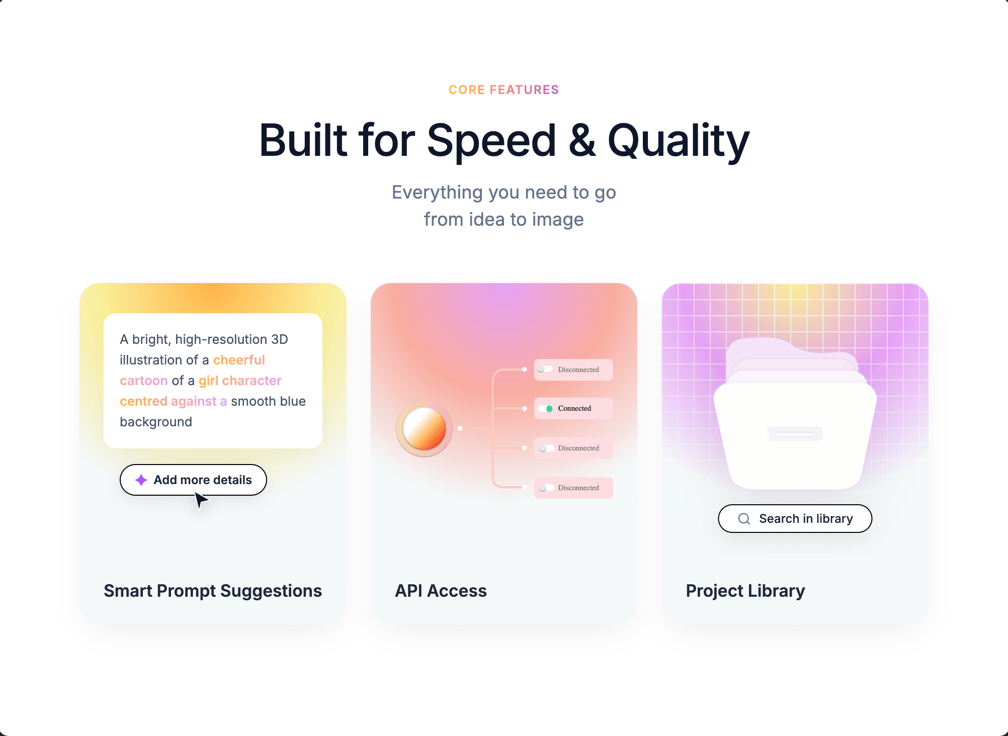
GFEATURES
免费
Glow Features
MotionTypeDepth
Featuresfeatures
KFOOTER
免费
Kresna Footer
TypeVideoMotion
Footerfooter
MSAAS
已付费
Minimal Workflow SaaS
MotionTypeGlass
SaaShero
AAUTH
免费
Aurora Onboard
TypeVideoMotion
Authhero
MFEATURES
免费
Max Reed Portfolio
GlassMotionVideo
Featuresfeatures
DECOMMERCE
已付费
Daisy Shop
VideoTypeMotion
Ecommercehero
CSAAS
已付费
CoderCrest
VideoTypeDepth
SaaShero
ASAAS
已付费
AI Automation Hero
VideoGlassMotion
SaaShero
SSAAS
已付费
Synapse Dark Hero
VideoMotionGlass
SaaShero
NLANDING PAGE
已付费
Nimbus Grid
GlassMotionType
Landing Pagehero
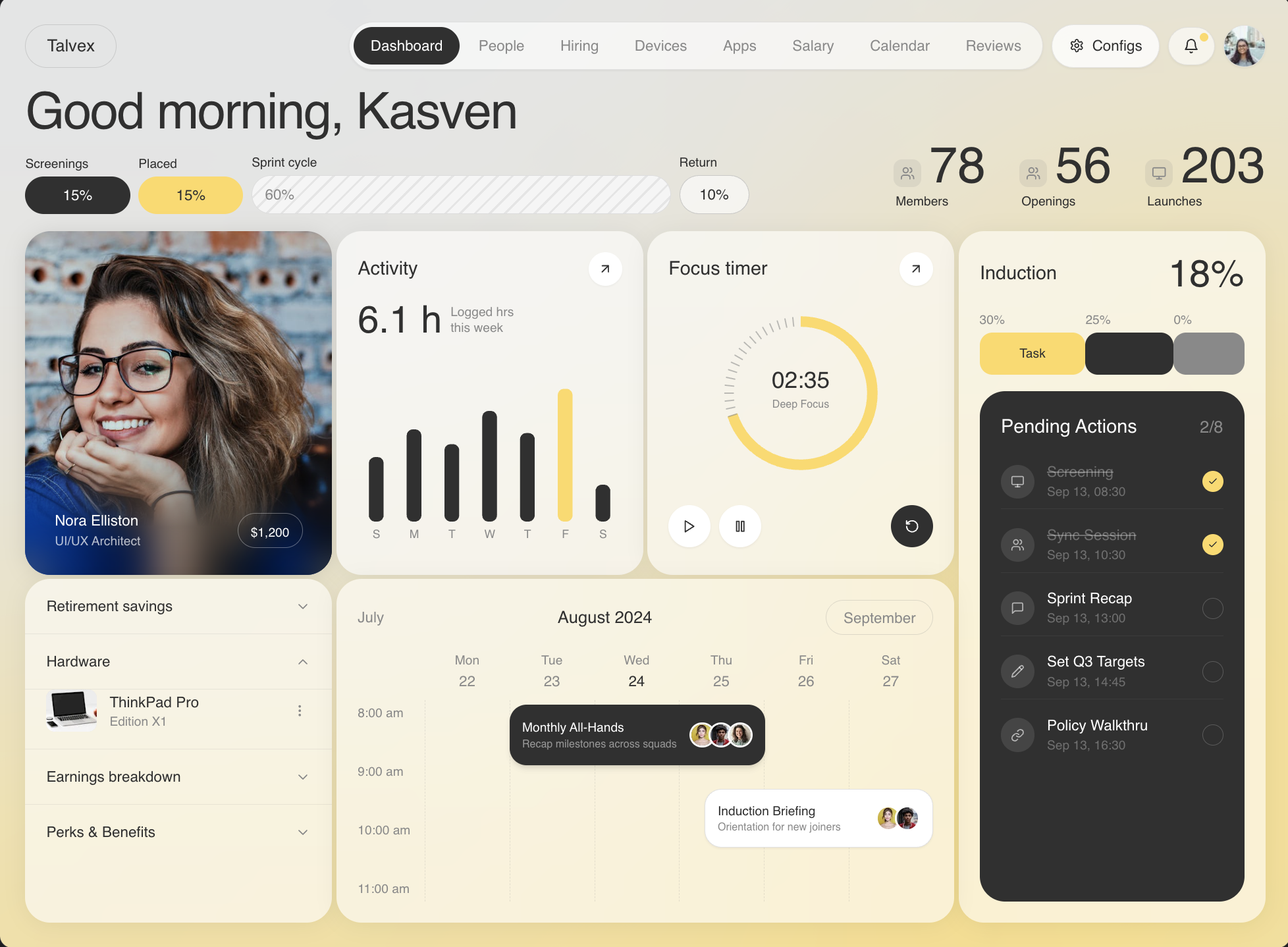
HSAAS
已付费
HR SaaS Hero
VideoTypeMotion
SaaShero
FHERO
已付费
Futuristic Cinematic
GlassTypeDepth
Herohero
CAGENCY
免费
Creative Studio
TypeMotionDepth
Agencyhero
CHERO
已付费
Cursor Follow
TypeVideoGlass
Herohero
ASAAS
免费
AI Image Generator UI
TypeGlassDepth
SaaShero
SHERO
已付费
SpeakUp Venture Hero
TypeVideoMotion
Herohero
NAUTH
已付费
NovaDesk Signup
TypeVideoMotion
Authhero
EHERO
免费
Equilibrium
GlassTypeVideo
Herohero
PLANDING PAGE
免费
Prisma Creative Studio
TypeMotionVideo
Landing Pagehero
BOTHER
免费
Blog Showcase
VideoTypeSystem
OtherBlog
EWEB3
已付费
Evergreen Finance
TypeMotionVideo
Web3hero
MSAAS
已付费
Modern HR Dashboard
TypeSystemGlass
SaaShero
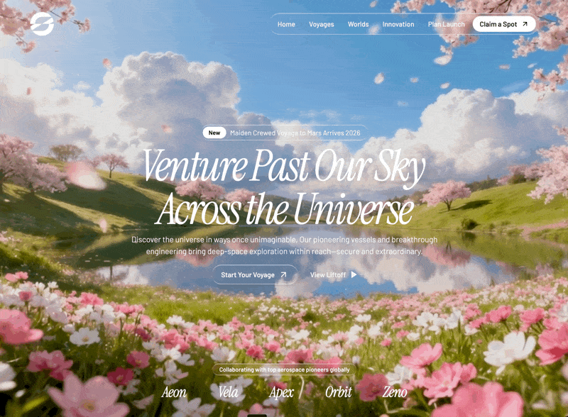
SLANDING PAGE
已付费
Space Voyage
GlassTypeVideo
Landing Pagehero
OAGENCY
已付费
Orbit Engineers
TypeMotionVideo
Agencyhero
PPRESENTATION
已付费
Pro AI Deck
TypeVideoGlass
Presentationhero
RHERO
已付费
Railroad.ai
GlassTypeMotion
Herohero
KFEATURES
已付费
Keep Ahead Features
TypeDepthMotion
Featuresfeatures
BFEATURES
已付费
Benefits Features
TypeMotionVideo
Featuresfeatures
SHERO
免费
Sentinel AI
DepthTypeMotion
Herohero
NFEATURES
已付费
Nexora Features
GlassVideoType
Featuresfeatures
SHERO
已付费
Sync AI
MotionGlassType
Herohero
ALANDING PAGE
已付费
AI Designer Agency
TypeGlassMotion
Landing Pagehero
SPRICING
已付费
SaaS Pricing Flow
VideoMotionGlass
Pricinghero
PHERO
免费
Prosthetics Hero
TypeVideoMotion
Herohero
OLANDING PAGE
免费
Orbis NFT
GlassVideoType
Landing Pagehero
CLANDING PAGE
已付费
Creative Agency
TypeVideoGlass
Landing Pagehero
AHERO
已付费
Automation Machines
TypeMotionDepth
Herohero
SSOCIAL
已付费
Social Media Posts
TypeVideoMotion
Socialsocial-media
TSAAS
已付费
Terra Geo Map
TypeVideoDepth
SaaShero
FSAAS
已付费
Finlytic AI Agent
TypeVideoGlass
SaaShero
PSAAS
已付费
Planet Orbit
GlassTypeVideo
SaaShero
TSAAS
已付费
Taskora SaaS Hero
SystemTypeGlass
SaaShero
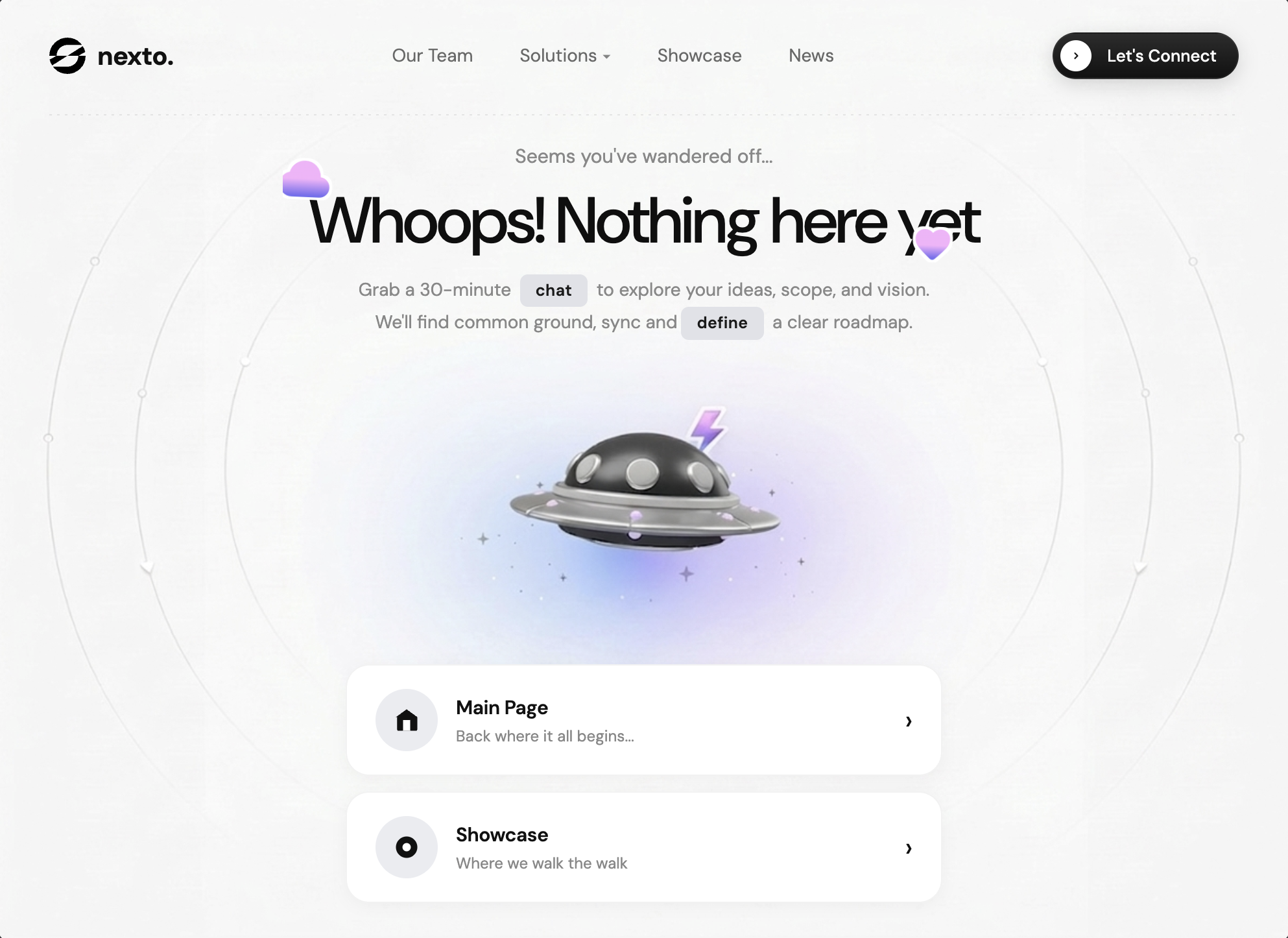
NOTHER
免费
Nexto 404
TypeMotionSystem
Otherhero
NHERO
已付费
Nexar
TypeSystemVideo
Herodashboard
PPORTFOLIO
免费
Portfolio Cosmic
MotionTypeVideo
Portfoliohero
ALANDING PAGE
免费
AI Designer Portfolio
MotionTypeSystem
Landing Pagehero
THERO
免费
Transform Data
VideoTypeMotion
Herohero
ULANDING PAGE
已付费
Urban Jungle
TypeMotionVideo
Landing Pagehero
SLANDING PAGE
已付费
Stellar Launch
TypeVideoMotion
Landing Pagehero
AHERO
免费
Asme
GlassTypeVideo
Herohero
NLANDING PAGE
免费
Neo Museum
TypeMotionVideo
Landing Pagehero
BAGENCY
已付费
Buzzentic Agency
TypeVideoGlass
Agencyhero
LHERO
已付费
Loader Animation
MotionTypeDepth
Herohero
DLANDING PAGE
已付费
Dreamcore Landing
MotionTypeGlass
Landing Pagehero
FLANDING PAGE
已付费
Focus AI
TypeVideoGlass
Landing Pagehero
VLANDING PAGE
已付费
Veloce Finance
TypeMotionVideo
Landing Pagehero
VLANDING PAGE
已付费
Vitara
MotionTypeVideo
Landing Pagehero
BSAAS
已付费
Bionova Biotech
VideoTypeMotion
SaaShero
VPORTFOLIO
已付费
Viktor Portfolio
TypeVideoMotion
Portfoliohero
SLANDING PAGE
免费
SkyElite Private Jets
TypeVideoGlass
Landing Pagehero
NLANDING PAGE
已付费
NOVA Space Systems
TypeVideoMotion
Landing Pagehero
ZLANDING PAGE
已付费
Zenith Realty
TypeMotionSystem
Landing Pagehero
NPRICING
已付费
Nex Max Upgrade
TypeVideoMotion
Pricingpricing
SLANDING PAGE
已付费
Scenic Travel
VideoMotionType
Landing Pagehero
SHERO
已付费
Solar Energy Hero
TypeGlassMotion
Herohero
SHERO
已付费
Scroll Landing Page
MotionVideoGlass
Herohero
FLANDING PAGE
已付费
FlowMate
MotionTypeVideo
Landing Pagehero
3HERO
免费
3D Collectible Hero
TypeDepthGlass
Hero3D Website
MSAAS
已付费
Mindloop
GlassMotionType
SaaShero
OWEB3
已付费
Orbit Web3
TypeVideoGlass
Web3hero
WWEB3
已付费
Wealth Video Hero
VideoGlassType
Web3hero
ASAAS
已付费
Apex SaaS
GlassTypeVideo
SaaShero
ILANDING PAGE
免费
Innovation
GlassTypeVideo
Landing Pagehero
TSAAS
已付费
Targo Logistics Hero
GlassTypeVideo
SaaShero
LAGENCY
已付费
Logoisum Video Agency
VideoType
Agencyhero
WLANDING PAGE
免费
Wanderful Hero
TypeGlassMotion
Landing Pagehero
YLANDING PAGE
已付费
Yacht Club
MotionTypeGlass
Landing Pagehero
ELANDING PAGE
已付费
E-commerce Website
TypeMotionDepth
Landing Pagehero
CLANDING PAGE
已付费
ClubX Investors
MotionTypeGlass
Landing Pagehero
ALANDING PAGE
已付费
AKOR Security
TypeVideoMotion
Landing Pagehero
FAGENCY
已付费
Framelix 3D Studios
MotionVideoDepth
Agencyhero
DPORTFOLIO
已付费
Dark Portfolio Hero
TypeMotionVideo
Portfoliohero
VHERO
已付费
VertexAI Hero
TypeGlassVideo
Herohero
CHERO
免费
Cybersecurity Hero
TypeMotionDepth
Herohero
CHERO
已付费
Cybersecurity Hero v2
TypeMotionSystem
Herohero
WHERO
已付费
Waitlist Hero
VideoTypeDepth
Herohero
GHERO
已付费
Growth Marketing SaaS
MotionGlassType
Herohero
MLANDING PAGE
免费
Mindloop Landing
TypeVideoGlass
Landing Pagehero
RHERO
免费
RIVR
TypeMotionGlass
Herohero
LHERO
免费
Luminex
VideoGlass
Herohero
NHERO
已付费
Naturecore SaaS
VideoMotionType
Herohero
NAGENCY
已付费
New Era Bold Hero
VideoTypeDepth
Agencyhero
VSOCIAL
已付费
Velorah Focus
TypeGlassMotion
Socialsocial-media
WLANDING PAGE
已付费
Weblex Dark Hero
VideoTypeGlass
Landing Pagehero
NLANDING PAGE
已付费
New Era Automotive Hero
VideoType
Landing Pagehero
NSAAS
已付费
Nickel Payments
TypeVideoSystem
SaaShero
DSAAS
已付费
Datacore SaaS Hero
VideoTypeSystem
SaaShero
NSAAS
免费
Nexora Automation
TypeMotionSystem
SaaShero