Solar Energy Hero
Build a single-page React + TypeScript + Vite hero section for a solar energy brand called "reposit." The page features a fullscreen background image that transitions between a daytime (Morning) photo and a nighttime (Night) photo using a custom pull-down animation. The entire page uses vanilla CSS (no CSS modules) with Tailwind installed but only used minimally (the design is almost entirely custom CSS). Google Font "Outfit" is loaded. The icon library is lucide-react (only the Zap icon is used).
TECH STACK AND CONFIG:
- Vite 5.4.2 with @vitejs/plugin-react, React 18.3.1, TypeScript 5.5.3
- Tailwind CSS 3.4.1 via PostCSS + Autoprefixer
- lucide-react 0.344.0
- @supabase/supabase-js 2.57.4 (installed but unused in this page)
- vite.config.ts: optimizeDeps.exclude includes 'lucide-react'
- tailwind.config.js: content array is ['./index.html', './src/**/*.{js,ts,jsx,tsx}'], no theme extensions, no plugins
- postcss.config.js: plugins are tailwindcss and autoprefixer
INDEX.HTML (verbatim):
<!doctype html>
<html lang="en">
  <head>
    <meta charset="UTF-8" />
    <link rel="icon" type="image/svg+xml" href="/vite.svg" />
    <meta name="viewport" content="width=device-width, initial-scale=1.0" />
    <title>Reposit Zero Electricity Bills Page</title>
    <link rel="preconnect" href="https://fonts.googleapis.com" />
    <link rel="preconnect" href="https://fonts.gstatic.com" crossorigin />
    <link href="https://fonts.googleapis.com/css2?family=Outfit:wght@300;400;500;600;700&display=swap" rel="stylesheet" />
  </head>
  <body>
    <div id="root"></div>
    <script type="module" src="/src/main.tsx"></script>
  </body>
</html>
IMAGES:
Two images stored locally in /public/images/:
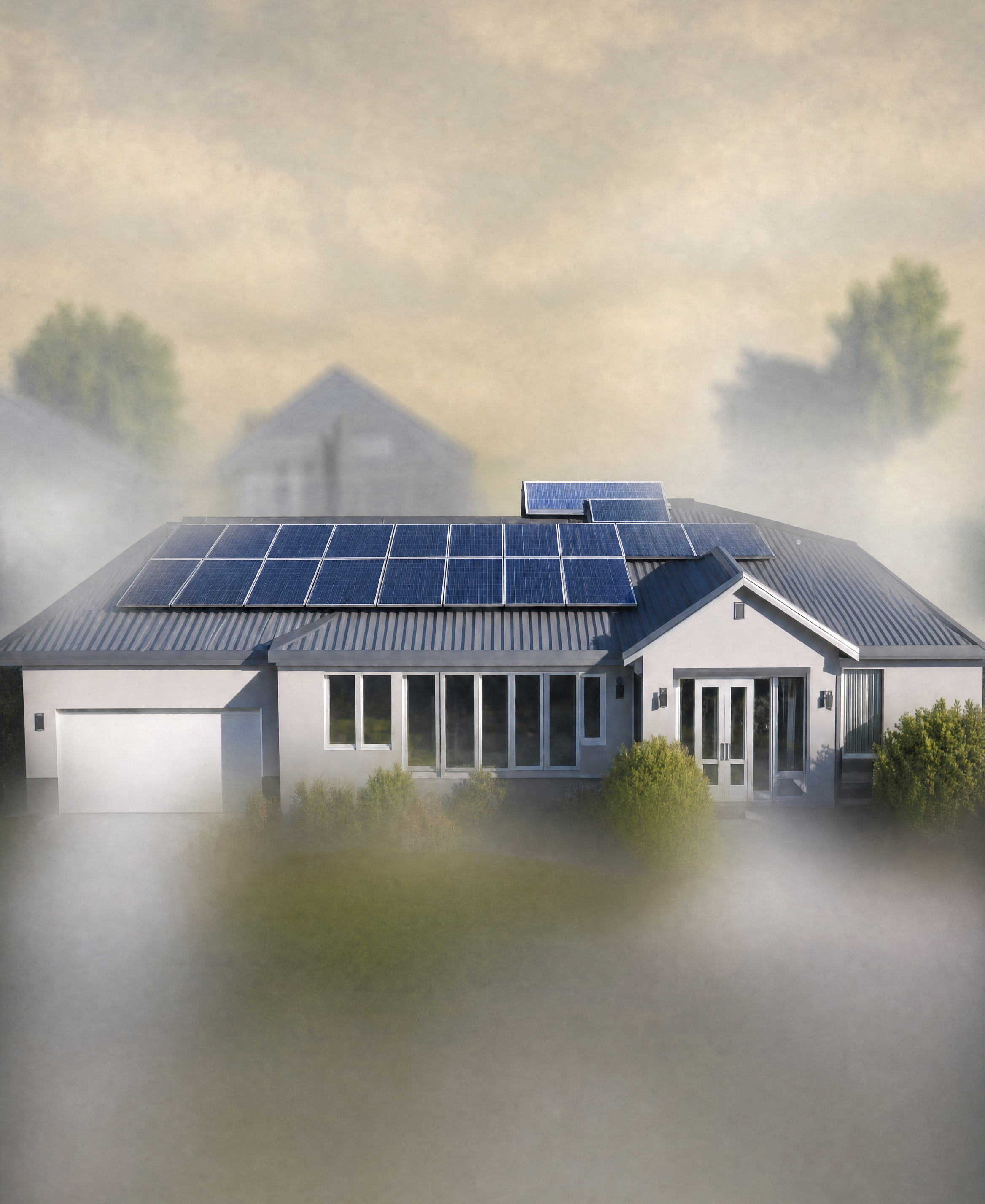
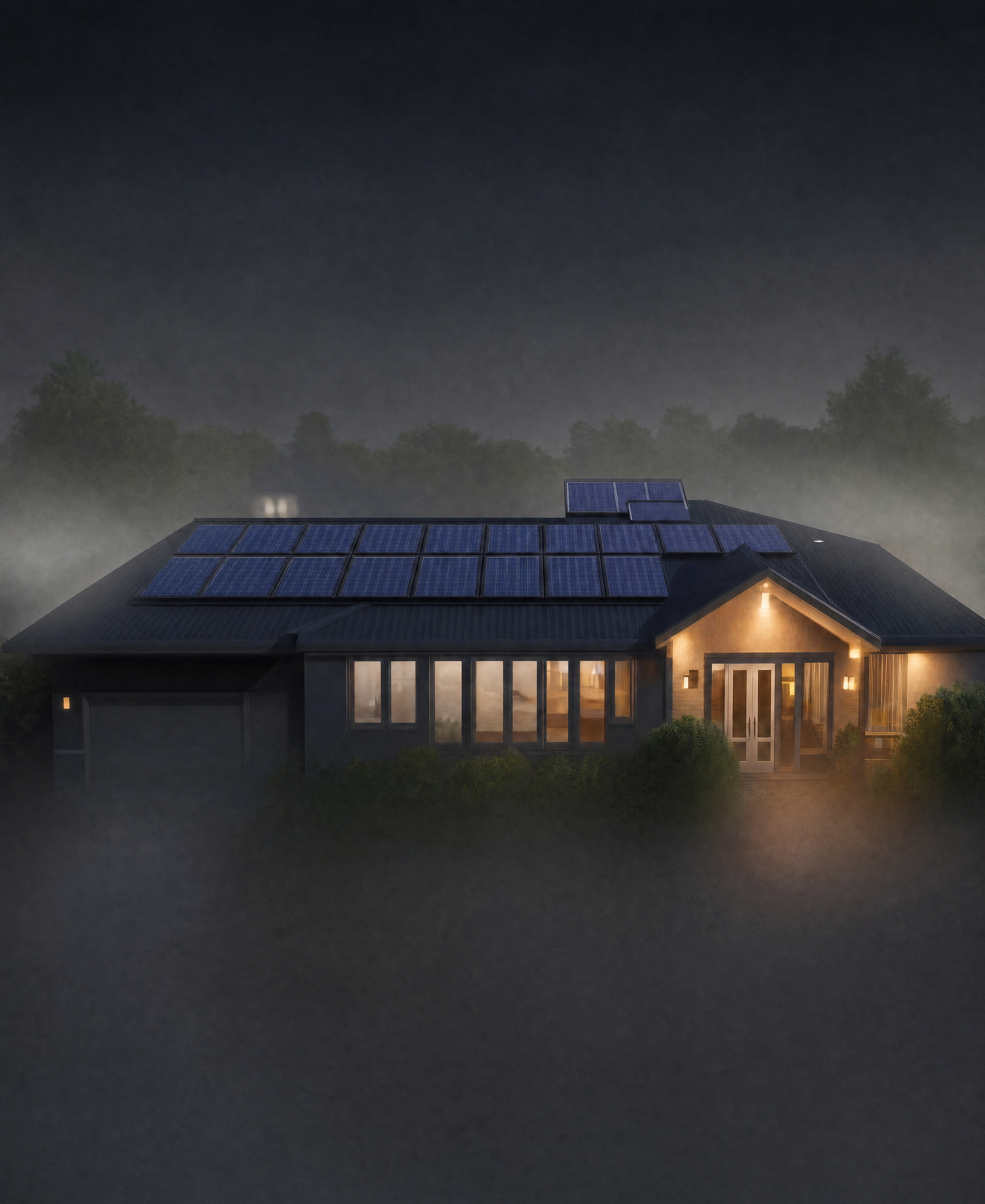
/images/hero-light.webp— the daytime/morning photo. Source URL: https://res.cloudinary.com/dsdhxhhqh/image/upload/v1778837456/hf_20260515_092045_b654224c-4741-458f-8596-fa5bfeffabbc_1_oyfhme.jpg/images/hero-dark.webp— the nighttime photo. Source URL: https://res.cloudinary.com/dsdhxhhqh/image/upload/v1778837447/hf_20260515_092102_24e30358-d694-4b70-8a56-a4f0887cf8ae_1_ry5dvs.jpg
Download both at build time so they serve locally (no external fetching at runtime).
MAIN.TSX (verbatim):
import { StrictMode } from 'react';
import { createRoot } from 'react-dom/client';
import App from './App.tsx';
import './index.css';

createRoot(document.getElementById('root')!).render(
  <StrictMode>
    <App />
  </StrictMode>
);
APP.TSX (verbatim):
Single component, no router, no external state. Uses useState, useEffect, useRef from React. Imports only { Zap } from lucide-react.
Constants:
LIGHT_IMG = '/images/hero-light.webp'DARK_IMG = '/images/hero-dark.webp'
State:
isDark(boolean, defaulttrue) — controls thememenuOpen(boolean, defaultfalse) — mobile drawer
Refs:
bgFrontRef(HTMLDivElement) — the foreground background layerbgBackRef(HTMLDivElement) — the blurred background layer behind itanimatingRef(boolean) — prevents double-clicks during transition
Effects:
- When
isDarkchanges: add/remove classlight-themeondocument.body - On mount: set both bgFrontRef and bgBackRef backgroundImage to
url(${DARK_IMG})
Toggle logic (toggleTheme(toDark: boolean)):
- If already in target state or animating, return early
- Set animatingRef true
- Set bgBack's backgroundImage to the target image
- Add class
pull-downto bgFront (triggers the pull-down CSS animation) - After 300ms timeout: set isDark state, set bgFront's backgroundImage to target image
- After another 30ms timeout: remove
pull-downclass, set animatingRef false
JSX structure (exact nesting):
div.hero
  div.blur-overlay.blur-overlay-top
  div.blur-overlay.blur-overlay-bottom
  div.hero-bg-wrapper
    div[ref=bgBackRef].hero-bg.bg-back
    div[ref=bgFrontRef].hero-bg.bg-front
  nav.navbar
    div.logo-container
      <Zap className="logo" size={32} strokeWidth={2} />
      span.brand-name "reposit"
    div.nav-links (add class "active" when menuOpen)
      a[href="#"] "How It Works"
      a[href="#"] "Our Cases"
      a[href="#"] "About Us"
      a[href="#"] "Careers"
      a[href="#"] "Resources"
      a[href="#"] "Customers"
      button.cta-button.drawer-cta "Get an Instant Quote"
    button.cta-button.nav-cta "Get an Instant Quote"
    div.hamburger (add class "active" when menuOpen, onClick toggles menuOpen)
      span
      span
      span
  div.hero-content
    h1.hero-title
      "$0 Electricity Bills"
      <br/>
      span.title-accent "for the next"
      " 7 years"
    div.theme-toggle
      div.toggle-indicator [inline style: transform is 'translateX(calc(100% + 4px))' when isDark, 'translateX(0)' when light]
      button.toggle-btn (add class "active" when !isDark), onClick => toggleTheme(false)
        span.label "Morning"
        span.subtext "$0 for Electricity"
      button.toggle-btn (add class "active" when isDark), onClick => toggleTheme(true)
        span.label "Night"
        span.subtext "$0 for Electricity"
    p.hero-footer
      "Forget the energy market, weather conditions and seasons; our Smart Controller guarantees you get no electricity bill for seven years."
INDEX.CSS (verbatim, every rule):
CSS Custom Properties on :root:
--bg-light: #ffffff--bg-dark: #000000--text-light: #3E3424--text-dark: #E5DEC9--active-toggle: #f5f8ea--transition-speed: 0.9s--pull-easing: cubic-bezier(0.32, 0, 0.67, 0)--return-easing: cubic-bezier(0.175, 0.885, 0.32, 1.4)
Universal reset: * { margin:0; padding:0; box-sizing:border-box; font-family:'Outfit',sans-serif; }
body:
- background-color: var(--bg-dark), color: var(--text-dark), overflow:hidden, transition: background-color 0.5s ease
body.light-theme:
- background-color: var(--bg-light), color: var(--text-light)
.blur-overlay:
- position:absolute, left:0, width:100%, height:10vh, z-index:2, pointer-events:none
- backdrop-filter: blur(25px) saturate(1.5), -webkit-backdrop-filter: blur(25px) saturate(1.5)
.blur-overlay-top:
- top:0
- mask-image: linear-gradient(to bottom, black 70%, transparent 100%)
- -webkit-mask-image: same
.blur-overlay-bottom:
- bottom:0
- mask-image: linear-gradient(to top, black 70%, transparent 100%)
- -webkit-mask-image: same
.hero:
- position:relative, width:100%, height:100vh, display:flex, flex-direction:column, align-items:center, justify-content:space-between, overflow:hidden
- background-image: radial-gradient(circle at center, rgba(255,255,255,0.05) 0%, transparent 100%)
body.light-theme .hero:
- background-image: radial-gradient(circle at center, rgba(0,0,0,0.02) 0%, transparent 100%)
.hero-bg-wrapper:
- position:absolute, top:0, left:0, width:100%, height:100%, z-index:1, overflow:hidden
.hero-bg:
- position:absolute, top:0, left:0, width:100%, height:100%
- background-size:cover, background-position: center 40%, background-repeat:no-repeat
- transform: scale(1.1)
.bg-front:
- z-index:2
- transition: transform 0.5s var(--return-easing), opacity 0.5s ease
.bg-back:
- z-index:1, filter: blur(40px), transform: scale(1.2)
.hero-bg::after (pseudo-element overlay):
- content:'', position:absolute, top:0, left:0, width:100%, height:100%, pointer-events:none
- background: radial-gradient(circle at center, transparent 0%, rgba(0,0,0,0.4) 100%), linear-gradient(to bottom, rgba(0,0,0,0.3) 0%, transparent 30%, transparent 70%, rgba(0,0,0,0.8) 100%)
body.light-theme .hero-bg::after:
- background: radial-gradient(circle at center, transparent 0%, rgba(255,255,255,0.2) 100%), linear-gradient(to bottom, rgba(255,255,255,0.3) 0%, transparent 30%, transparent 70%, rgba(255,255,255,0.8) 100%)
.navbar:
- width:100%, max-width:100%, padding:24px 30px, display:flex, justify-content:space-between, align-items:center, z-index:110
.hamburger:
- display:none, flex-direction:column, gap:6px, cursor:pointer, z-index:120
.hamburger span:
- display:block, width:28px, height:2px, background:currentColor, border-radius:2px, transition:0.3s
.hamburger.active span:nth-child(1): transform: translateY(8px) rotate(45deg) .hamburger.active span:nth-child(2): opacity:0 .hamburger.active span:nth-child(3): transform: translateY(-8px) rotate(-45deg)
.logo-container: display:flex, align-items:center, gap:12px
.logo: height:32px, color:#ffffff, transition: color 0.5s ease body.light-theme .logo: color:#000000
.brand-name: font-size:24px, font-weight:400, letter-spacing:-0.5px, color:#ffffff, transition: color 0.5s ease body.light-theme .brand-name: color:#000000
.nav-links: display:flex, gap:32px .nav-links a: color:inherit, text-decoration:none, font-size:14px, font-weight:500, opacity:0.7, transition: opacity 0.3s .nav-links a:hover: opacity:1
.cta-button: background:#ffffff, color:#000000, border:none, padding:12px 24px, border-radius:8px, font-weight:600, font-size:14px, cursor:pointer, transition: transform 0.3s, background 0.3s .drawer-cta: display:none body.light-theme .cta-button: background:#000000, color:#ffffff .cta-button:hover: transform: translateY(-2px), box-shadow: 0 10px 20px rgba(0,0,0,0.1)
.hero-content: flex-grow:1, display:flex, flex-direction:column, align-items:center, justify-content:flex-start, text-align:center, padding:30px 20px 0, z-index:5
.hero-title: font-size:56px, font-weight:500, line-height:1.0, max-width:1000px, margin-bottom:40px, letter-spacing:-1px, color:var(--text-dark), opacity:0.95
.title-accent: transition: color 0.5s ease body:not(.light-theme) .title-accent: color:#10100F body.light-theme .title-accent: color:white body.light-theme .hero-title: color:var(--text-light), opacity:0.95
.theme-toggle: background: rgba(210,198,171,0.15), backdrop-filter: blur(20px), border:none, padding:2px 1px, border-radius:8px, display:flex, gap:4px, margin-top:auto, margin-bottom:8px, position:relative body.light-theme .theme-toggle: background: rgba(210,198,171,0.25), border:none
.toggle-btn: padding:6px 40px, border-radius:4px, border:none, background:transparent, color:#ffffff, cursor:pointer, z-index:1, transition: color 0.3s, display:flex, flex-direction:column, align-items:center, gap:4px .toggle-btn .label: font-weight:500, font-size:18px .toggle-btn .subtext: font-size:11px, opacity:0.6
.toggle-indicator: position:absolute, top:2px, left:1px, width:calc(50% - 3px), height:calc(100% - 4px), background:var(--active-toggle), border-radius:4px, transition: transform 0.5s cubic-bezier(0.175, 0.885, 0.32, 1.275), z-index:0, box-shadow: 0 4px 12px rgba(0,0,0,0.1) body:not(.light-theme) .toggle-indicator: transform: translateX(calc(100% + 4px))
.toggle-btn.active: color:#3E3424 !important .toggle-btn.active .subtext: opacity:0.8
.hero-footer: max-width:600px, margin-bottom:60px, margin-top:0, color:var(--text-dark), opacity:1, font-size:16px, font-weight:300, line-height:1.6, z-index:5 body.light-theme .hero-footer: color:var(--text-light)
.pull-down: transform: translateY(20vh) scale(1.1) !important, opacity:0.8 !important, transition: transform 0.3s var(--pull-easing), opacity 0.3s ease !important
@keyframes fadeIn: from { opacity:0; transform:translateY(20px) } to { opacity:1; transform:translateY(0) } .hero-content > *: animation: fadeIn 1s ease forwards .hero-title: animation-delay:0.2s .theme-toggle: animation-delay:0.4s .hero-footer: animation-delay:0.6s
MOBILE BREAKPOINT (@media max-width:768px):
- .hero-title: font-size:42px, margin-bottom:30px
- .navbar: padding:16px 20px
- .hero-bg: background-position: center 40%, transform: scale(1.2)
- .pull-down: transform: translateY(20vh) scale(1.2) !important
- .nav-links: display:none, position:fixed, top:0, right:0, width:100%, height:100vh, background:var(--bg-dark), flex-direction:column, justify-content:center, align-items:center, z-index:100, gap:40px, transition: transform 0.4s cubic-bezier(0.77,0,0.175,1), transform:translateX(100%)
- body.light-theme .nav-links: background:var(--bg-light)
- .nav-links.active: display:flex, transform:translateX(0)
- .nav-links a: font-size:24px, font-weight:600
- .cta-button.nav-cta: display:none
- .drawer-cta: display:block, width:200px, margin-top:20px, padding:16px
- .hamburger: display:flex !important
- .theme-toggle: flex-direction:row, width:calc(100% - 40px), max-width:400px
- .toggle-btn: padding:12px 20px, flex:1
ANIMATION AND TRANSITION SUMMARY:
-
Page load fadeIn: each hero-content child fades in with
animation: fadeIn 1s ease forwards. Staggered delays: title 0.2s, toggle 0.4s, footer 0.6s. Keyframes go from opacity:0 + translateY(20px) to opacity:1 + translateY(0). -
Theme toggle pull-down: When switching themes, the front background div gets class
pull-downwhich appliestransform: translateY(20vh) scale(1.1)withtransition: transform 0.3s cubic-bezier(0.32, 0, 0.67, 0)andopacity: 0.8. After 300ms, the image source swaps and pull-down is removed. The return uses the bg-front's own transition:transform 0.5s cubic-bezier(0.175, 0.885, 0.32, 1.4)(overshoot/bounce easing). -
Toggle indicator slide:
transition: transform 0.5s cubic-bezier(0.175, 0.885, 0.32, 1.275)— slides left/right between the two buttons with a slight overshoot. -
Body background color:
transition: background-color 0.5s ease -
Logo and brand name color:
transition: color 0.5s ease -
CTA button hover:
transform: translateY(-2px)withtransition: transform 0.3s -
Nav links opacity hover:
transition: opacity 0.3s -
Mobile nav drawer:
transition: transform 0.4s cubic-bezier(0.77, 0, 0.175, 1)from translateX(100%) to translateX(0) -
Hamburger spans:
transition: 0.3sfor the X animation